“Blue is the only color that maintains its character in all its tones.” — Raoul Dufy
In the realm of colors, blue holds a special place, known for its ability to evoke feelings of trust, tranquility, and relaxation.
This article delves into the intriguing question, “What color makes blue?”
While blue is a dominant color on Earth, its rarity in natural pigments presents a unique challenge in its creation.
The journey to understanding blue takes us through various shades like light blue, dark blue, muted blue, and warm blue, each with its significance and application.
From the calming light blues ideal for serene environments to the authoritative dark blues representing intelligence and elegance, we explore the art of mixing colors to achieve the perfect shade of blue.
This exploration is not just about following color recipes; it’s an artistic endeavor to understand the complexities and subtleties of blue, a color as deep and vast as the oceans and skies.
The Significance of Color Blue
Blue can be easily found in our daily lives; it is associated with harmony and peace.
Blue is a color that indeed invokes the feeling of trust, tranquillity, and relaxation. Blue is very prominent on Earth, but it is rare.
Only one of 10 flowers has a blue color, which is even rarer in animals.
The main reason behind this is that there is no true blue in color or pigment in nature.
Both animals, as well as plants, perform tricks of the light to have a blue appearance.
Many shades of blue exist in nature. These include light blue, dark blue, muted blue, warm blue, etc.
The list is long, but by the end of this article, you will know what color makes blue, and you will be able to create a perfect color for your palette.
We are now returning to our question: What color makes blue?
The blue color is obtained by mixing primary shades, but mixing colors is not an easy task as it is quite difficult compared to following the color recipes.
This article focuses on mixing colors rather than following a straightforward formula.
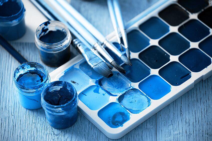
Mixing of Light Shades of Blue
Light blue is one of my favorite and most versatile colors.
Light blue has a calming and relaxing appearance that is easy on the eyes, making it perfect for use in large amounts.
Blue signifies trust and loyalty, which makes it a common choice for business logos.
There are many situations when there is a need to mix different shades of blue that are lighter.
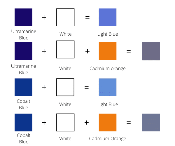
Here is a chart depicting the mixing of light blue with cobalt blue and ultramarine blue.
It can be seen from the chart that ultramarine blue is used in the first two-color mixtures, and the cobalt blue color is used in the last two-color mixtures.
The light blue color is curated by mixing blue with white. The result of mixing these colors will give a bright, saturated color.
Cobalt blue and Ultramarine blue produce a very bright and saturated color when mixed with white.
A muted blue can be obtained by mixing a little bit of orange with the blue color.
As depicted in the chart, a little muted light blue is obtained by mixing the color orange with light blue.
When the color blue is mixed with white, ultramarine blue gives a warmer tone, while cobalt blue provides slightly cooler hues.
By now, it must be clear what color makes blue.
1. What Color Makes Blue: Creating Darker Shades
Do you still have a question: what color makes blue? Do not worry.
We will cover all the blue hues so that you can find the exact shade for your palette.
Dark blue is a color that is often confused with navy blue, as there is a close relationship between them.
It lies on the outer band of the color wheel and represents authority, intelligence, and elegance.
The shade of blue which is used to create a dark blue color is ultramarine blue.
It is very dark, so it becomes straightforward to create dark colors with it.
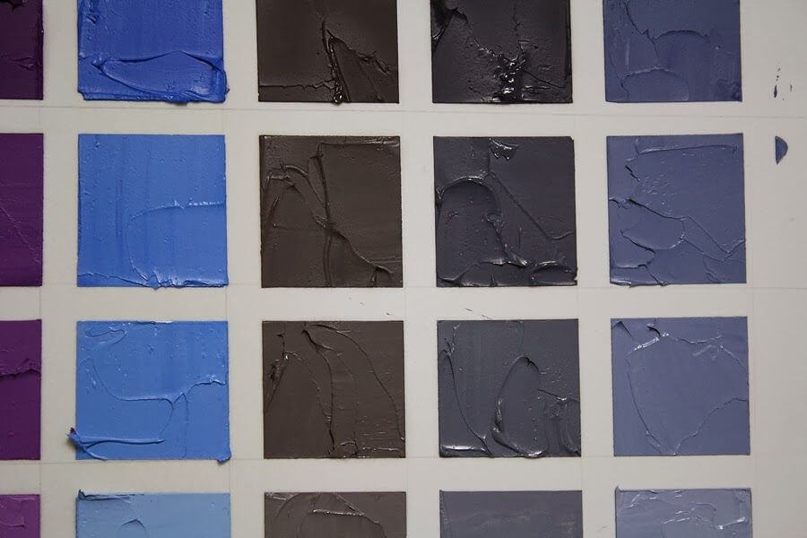
Here is a chart depicting colors that make dark blue.
Dioxazine Purple
Dioxazine adds a little purple tint to the ultramarine blue.
The graph shows that it creates a gorgeous dark color when combined with ultramarine blue.
Dioxazine Purple with Pthalo Green
You can see in the second row of the chart when Dioxazine purple is mixed with ultramarine blue and Pthalo green, and then it creates a dark blue shade along with a tint of green color.
Burnt Amber
Burnt umber is used to create a dark blue color and can be used to create a great muted blue. If your design requires a blue shade that is not saturated or bright, burnt umber is ideal.
Alizarin Crimson and Pthalo Green
When alizarin crimson is blended in Pthalo green, then a beautiful shade of black is created.
If you want black color, you can use these two, but our question was, what color makes blue?
So, to obtain a lovely shade of dark blue, you can add ultramarine blue to this mixture.
2. How to Create Muted Shades of Blue?

Let us begin by defining what a muted color is. Muted is a word used for dulled, unsaturated, or adding a grey texture to color.
It refers to the class of colors which have a low Chroma. Vivid color is the opposite of muted color.
Vivid colors are essential for a painting as they highlight the primary elements of the painting.
However, it is far more effective to use a combination of muted colors with vivid colors.
The depth and effect of vivid color are diminished if it is adjacent to another vivid color.
For example, if you surround dark blue with red, they will not complement each other, and each will fight for attention.
The resultant color combination of these vivid colors will be uncomfortable to gaze at.
A great deal of time is spent in mixing time for creating muting blue colors.
Artists rarely use the natural blue color from the tube.
As described earlier, ultramarine blue and cobalt blue are very bright colors and cannot be used directly for painting.
So, let us begin with shades that can be used to curate muted blue textures.

- Full Package: The DIY set features 20 foldable sheets of acrylic art paper, 22 0.74 US fl oz (22 ml)...
- Easy to Use & Display: Simply use the marked guidelines to instantly fold the acrylic paint paper...
- Heavyweight Paper For Acrylic Painting: These 220 lb (360 gsm) wood pulp sheets are suitable for a...
- Designed and Created by Artists: Here at Arteza, we are passionate about creating products that...
Complimentary Colors
While mixing muted colors, complimentary colors are one of the most important things you should remember.
A complementary color is the opposite in the color wheel, as depicted in the image.
As you can see from the image, orange is directly opposite from blue, so both are complementary colors; yellow and purple are complementary colors.

- Illustrations of Color Harmonies
- Complementary, Split Complementary,
- Defines Primary and Secondary
- Easy to Use and Understand
Mixing of Orange with Cobalt Blue or Ultramarine Blue
In the first row, it can be easily seen that when cadmium orange is mixed with ultramarine blue, a dull color is produced.
This dull color is obtained as orange removes the ultramarine blue’s brightness or saturation.
In other words, we can say blue can be made less blue by using the color orange.
This clearly explains the color wheel and what happens when we mix two complementary colors.
You should take care of it while mixing orange with blue because if you mix too many orange colors with blue, you can get the green color. If this situation arises, add a bluer color to the mixture to obtain a muted hue.
Mixing Burnt Umber with Cobalt Blue or Ultramarine Blue
Another great option to create a muting blue shade is by mixing burnt umber with blue.
The shade obtained by following this procedure is slightly brown in texture, so if you want a richer muted blue, they should prefer orange.
But there will be many times when you will require a brownish muted blue; in that case, you can use the above mixture to obtain your required shade.

- DANIEL SMITH is the Innovative Manufacturer of Beautiful Watercolors for Artists Worldwide, and...
- This neutral, non-staining primary blue will subtly modify most pigments. Considered a "mixing...
- Excellent Lightfastness, Semi-transparent, Granulating, Low staining
- PB 28
3. Mixing of Warm Shades of Blue
Temperature is considered relative when it comes to the mixing of colors.
Blue is generally considered a cool color, so it is possible to mix its warm shades.
The first shade of blue that can be considered a warm shade is ultramarine blue, as it leans towards purple.
But some masterpieces require an extra effort, and you need to make an even warmer shade of blue.
Mixing of Alizarin Crimson with Blue
When alizarin crimson is mixed with blue, then a purplish-blue color is obtained.
The ultramarine purple mixture has a more vital shade of blue than cobalt blue because ultramarine purple already has a tint of purple in it.
4. Mixing of Burnt Umber with Blue
When the color blue is mixed with burnt umber, a soothing, warm shade of blue is obtained.
Mixing of Cadmium Green with Blue
The warm blue shade created using this mixture is lesser warmer than the above two mixtures.
But if you want a shade that is not overly warm, this mixture is perfect for you.
Below is one more chart where ultramarine blue is replaced by cobalt blue to create warmer hues of blue.
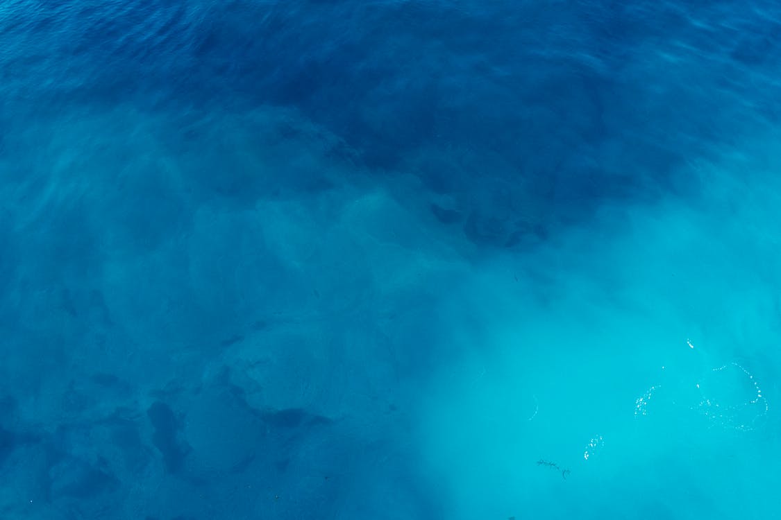
5. Mixing of Turquoise Blue Colors
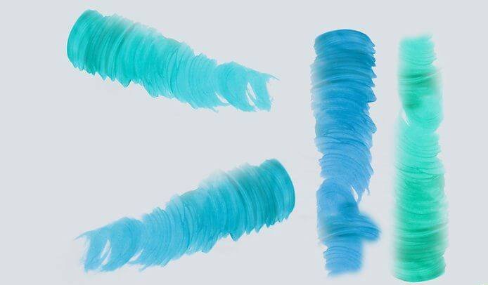
Turquoise is a mesmerizing color, also known as the ocean’s color; it is slang used for the waters of the Caribbean.
Or you can gaze at the endless sky with a little green.
Turquoise is a color that signifies the calmness of blue, the energy of yellow, and the growth of green.
Turquoise goes well with greys and sets off oranges and pinks. Here are some of the great mixtures for your palette:
Mixing Cadmium Green Color with Blue
When ultramarine blue and cobalt blue are mixed with cadmium green, the resultant mixture has a tint of turquoise.
White is further added to the mixture to make it lighter. The final mixture is a light blue that leans towards turquoise.
6. Mixing Veronese Green with Blue
Veronese green is a bright, cool shade of green. The most distinct feature of this mixture is that it retains its blueness, unlike when mixed with cadmium green.
Both cobalt blue and ultramarine blue are mixed with Veronese green, creating rick hues.
When the white was added to these mixtures, the result was lighter but equally rich in texture.
The more one paints, the more he or she realizes the beauty of the color blue.
The next time you observe a masterpiece or a design with plenty of blue hues, you should observe the subtleties of the color and spend some quality time creating a blend of different shades of blue.
It would help if you gave yourself true freedom to try and work with different color combinations.
You will surely be astonished by the variety of colors you will get by mixing colors!
So, it would help if you had the answer to what color makes blue.
- The Package Includes 2 Wood Painting Palettes
- Size: 14inches x 10 Inches
- With Large Thumb Hole And Oval Shape
- Suitable For Left Or Right Hand Holding
Conclusion
The exploration of “What color makes blue?” reveals the intricacy and beauty of this fundamental hue.
Blue, a symbol of trust and calmness, can be created through a complex interplay of colors far beyond the simplicity of a primary color wheel.
This article has illuminated the various methods of creating shades of blue, from the light and soothing to the dark and authoritative.
By understanding the techniques of mixing primary shades and using colors like ultramarine blue, cobalt blue, and others, we gain a deeper appreciation for the versatility and depth of blue.
Whether creating a muted tone to complement a vibrant palette or crafting a warm hue to evoke a specific mood, the art of making blue is as varied as it is fascinating.
Ultimately, the journey through the world of blue enriches our perception of this color, enabling us to see beyond the surface and appreciate the nuanced artistry in every shade.