
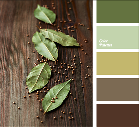
Exploring the art world, one often encounters the question, “What is a muted color?”
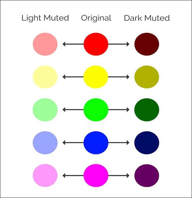
Muted colors, characterized by their subdued, dulled, or greyed appearance, contrast the vibrancy of bright colors like yellow and red.
These colors, lighter in shade and lower in saturation, are not prepared as standard hues but are custom-made to suit specific artistic needs.
Their tone and texture deviate from conventional colors, offering a unique spectrum of possibilities for artists.
This article delves into the essence of muted colors, examining their uses, advantages, and the process of creating them.
By comparing a normal cloudy sky to a vibrant evening sky, one can understand the distinct impact of muted colors.
They are not just elements of an artwork; they are experiments in creativity, allowing artists to mix, match, and discover new hues that convey emotions ranging from calmness to intensity.
What is a Muted Color: A Detailed Introduction
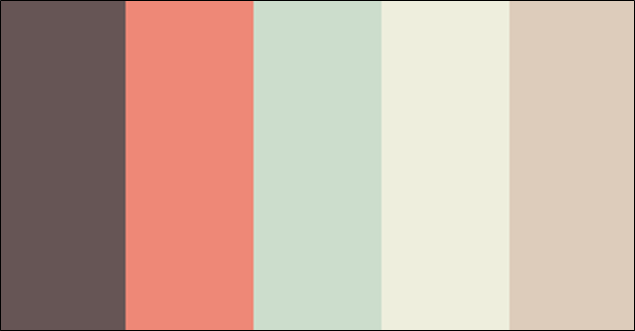
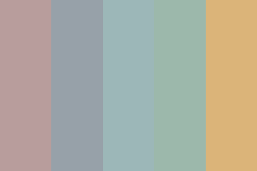
Muted colors are a shade lighter than contrasting colors. They are not as bright or vibrant as yellow or red.
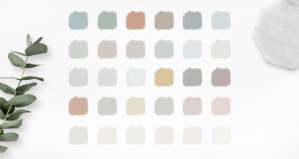
Such colors are the opposite of contrasting and bright colors. They are usually called subdued, dulled, or greyed.
These colors are generally prepared on their own as per the requirement.
The tone, texture, and everything else varies from the normal color.
You can take an example by comparing a normal cloudy sky to a vibrant evening with a mix of orange and yellow spreading far and wide.
Using muted colors is always fun and exciting.
Sometimes, you know what color the mixing of two colors will bring, while sometimes, you experiment to see the possibility of a new color.
Muted colors are more of an experiment to create your own desired color.
Some amazing, muted color paintings stand strong in appearance even though contrasting colors are absent.
So, let us study more in detail and find out various other aspects of muted colors.
Uses of Muted Colors
Muted colors are used to balance the color saturation in your art frame.
When one frames something with high saturation to balance the vibrancy of the color, muted colors are used.
Sometimes, the art frame also consists of art made only of muted colors.
As muted colors are dull and low in saturation, they emit peacefulness and calmness through their presence.
So, muted colors are used to fit in or balance the saturation of two contrasting colors.
Advantages of Muted Colors
- Silent Shiner: Muted colors act as a silent shiner in the painting. They work as the background or, rather, the supporting plot of the main plot and bring the main subject to the highlight.
- Colors of Your Own Choice: Muted colors allow you to make colors of your own choice. You do not have to adjust to only the existing colors; you can make the colors of your own choice by mixing various others and obtaining the needed color.
- The Choice to Create Your Own: Muted colors do not set any boundaries for you; they just let you explore your reality of colors by mixing the existing ones. So that is always fun and exciting.
- Muted Colors Also Play the Lead: Usually, artworks using muted colors also greatly catch your attention. It depicts peace, stillness, and purity through its vivid display of colors.
Disadvantages of Muted Colors
- Messy: Sometimes mixing too many colors can be messy as it consumes most of your time in finding the correct texture, which would make your artwork fit.
- Tedious & Tiring: Getting the color of your choice, especially the muted ones, is hectic. You need proper knowledge and quantity mixing tactics to get the desired color. Most of the time, this mixing becomes a very tedious and tiring job.
- Expensive: Mixing two or more colors to get your desired color often leads to losing quite a lot of money. So, sometimes, using muted colors can be costly.
- Not Getting the Required Texture: Despite mixing several colors, we still fail to obtain the color of our choice, which results in great disappointment later.
How to Make Muted Colors?
As we know how important and fun muted colors are, learning to make muted colors will be equally fun.
As the definition says, the colors with low saturation are muted. So muted colors are generally made by mixing two different colors.
Let us find out the different colors by which we can get the desired muted colors.
- Black Color: You can always use black to mix with any color and create the desired muted color.
- White: White is another beautiful way of creating a light-saturated color that embarks radiance and elegance from the art frame.
- Grey: You can use the color grey to get the shade of the required muted color.
- Mixing Complementing Colors: You can use two complementing colors to get a muted version of the color.
- Earthly/Brown: Mixing earthly or a shade of brown color can help create amazing textures of muted colors, too.
How to Use Muted Colors?
Muted colors are the soul of an artwork that an artist wishes to portray.
Of course, bright, contrasting colors are instant attention-gainers, but muted colors build up an environment in which the contrasting colors pop up beautifully.
One can directly start using the muted colors from the palate.
Do not look for muted colors already created or used in several artworks. Try to keep it original and real.
Take inspiration from real pictures that you wish to portray on your frame.
And then, similarly, try creating too many muted colors by mixing colors of your choice and need. The key to using muted colors is to start by just mixing them.
So, mix and mix the colors of your choice and have fun with the colors.
Always remember not to analyze the color. Make sure that you are having fun with it.
Why Do We Need to Use Muted Colors in Painting?
Paintings are an exploration of colors. You create, you destroy it all about new ideas. Those ideas are either inner self-driven or can come from outer influence.
The artwork on the painting depicts a message, and the way you present it makes it worth watching.
One cannot continuously use bright colors in all the artworks.
It needs variations and, most importantly, a touch of reality.
Reality never comes out of only bright colors; it is a combination of muted and bright or sometimes only muted or bright.
One needs to use muted colors to depict that touch of reality and thought.
As already said, muted colors build a plot to the story you are willing to convey.
And more often, mixing two colors to see what new things it can bring is always fun, isn’t it?
Hence, we use muted colors in paintings to experiment, explore, and convey the touch of realness and joy.
Below are a few paintings depicting the depth and importance of muted colors in an art frame.
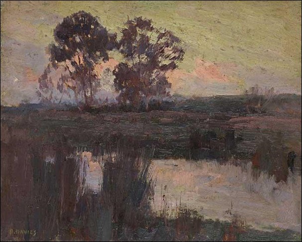
“Here in the above painting, too, muted colors provide a platform for the main subject to pop out and shine. And that is the reason why the sun with bright saturation grabs your attention first.”
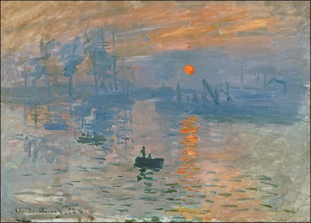
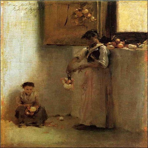
“The above picture, too, depicts an outstanding contribution of muted colors that brings the main subject to the focus.”
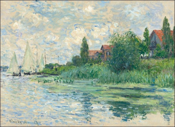
“The above painting is a fantastic amalgamation of high and low saturation of idealized colors.”
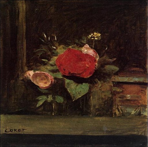
“In the above picture, red roses instantly catch your attention because of the muted colors and the background they were built to highlight.”
Conclusion
In summary, understanding “what is a muted color” is essential for both budding and seasoned artists.
Muted colors, with their less saturated and more subdued appearance, offer a versatile palette for creating art that resonates with realism and tranquility.
While they present certain challenges like the complexity of mixing and potential expense, the benefits they bring to artwork are undeniable.
They enable artists to create their own shades, set a background that highlights the main subject, and add a touch of serenity to the artwork.
Through the study of various paintings and the application of muted colors, we see their vital role in creating a balance between vibrancy and calmness, thereby enhancing the overall impact of the art.
Muted colors are not just about toning down brightness; they are about opening up a world of creative possibilities, allowing for the exploration of subtlety and depth in artistic expression.