
Trying to find a color for your walls that’s versatile, adaptable, and can be used to paint anywhere in the house is a task that can make even some of the best interior designers break a sweat.
But don’t you worry, because we’re here to give you a detailed look at some of the colors we researched and found to be neutral yet appealing, and that goes with everything, from even the most modern interiors to retro-classics?
In this article, we’ll dive into the shades of greys, whites, and beiges; we’ll talk about their different blends and their versatility to adapt to every decor around them and simultaneously complement them.
Let’s paint together!
Greige, The Magic!
What ‘Greige’ is, as a word, is a combination of ‘grey’ and ‘beige,’ and it is the same. Greige is a whole band of colors made with varying quantities of grey and beige that come out as different shades, all neutral and all versatile colors.
We chose this specifically because we’re not taking whites and greys totally out of the picture, but at the same time, we’re also introducing something far less monotonous, such as Beige!
What this does is we’ll get the neutral appeals of both white and grey, but at the same time, just a little and the right amount of appeal is borrowed from Beige, which makes Greige the modern-day mass pleaser.
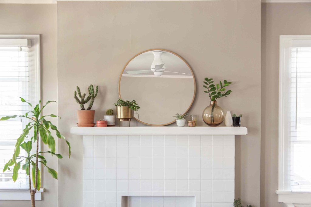
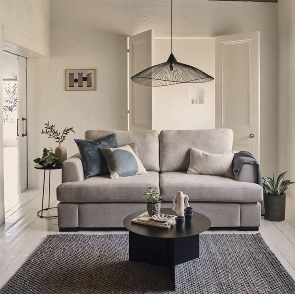
Now let’s move to the cream of this situation, which is that Greige is a band that is best complimented by both warm and lighter-toned colors; it goes best with warm tones of brown walls and lighter tones of whites, creams, blacks, and greys equally well.
So, like we said, Magic!
Top Shades from The Greige Rainbow
Now, to add more perspective and make shades even easier to choose, we have a range of combinations made from greys and beiges. These shades, in perspective, all share the amazing versatility of grey, white, and beige.
So far, if we’ve successfully convinced you to choose Greige, below are the best combinations of grey and beige listed along with their features, allowing you to pick the best for yourselves:
1. Revere Pewter (HC-172)
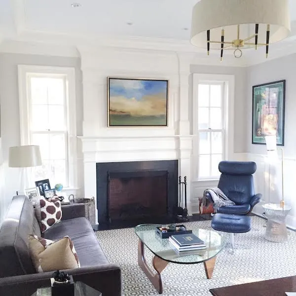
For more than 15 years, this color has been the favorite of so many people due to its leaning towards grey a bit more than beige, but it shows the undertones as green, which is a sign of it being a blend of beige as well. As Greige colors go, this one is regarded by many as one that is timeless, very adaptable, and a no-brainer classic shade.
Works best with floor plans that boast more open spaces and are the ideal choice for the main living area; this color’s openness and welcoming nature is what’s behind this recommendation, and also, since it looks more greyish when paired with a good lighting system.
2. Colonnade Grey (SW 7641)
With just enough beige to make its overall undertone shift from cool (which is for most greys) to a welcoming warm. The perfect amount of beige in this shade makes it a popular choice, similar to the Revere Pewter.
It has a very neutral appeal, which you should consider when looking for a versatile shade. There is a lack of green undertones, which makes it the perfect choice for thousands of lighting options cause it maintains its neutrality well.
3. Balboa Mist (OC-27)
The perfect blend of both warm and cool undertones, this shade is perfect for someone who likes minor natural variations in perception of the color.
This color changes its nature slightly over the entire day concerning natural light. This is more suited for places where you don’t want to commit to a single color, and little variations are actually what you’re looking for.
Word of caution: we highly recommend you try this shade in various lighting conditions before making up your mind about it.
4. Agreeable Grey (SW7029)
As the name suggests, this is one of the most balanced shades on this list, and it blends well with almost anything you throw at this gentleman of paint color. Interior designers love it and are highly recommended indoors with both artificial and natural light.
There is a touch of purple undertone in this shade, which is not perceived easily, making it an even easier pick, a mass-pleaser that goes well with any other color in the vicinity.
5. Edgecomb Grey (HC-173)
Now, this is one shade on the list that you’ll find inclined more towards the Beige than the Grey on the band; this combination is very futuristic. Why? Well, it’s a cause of the shift in perception it offers; when viewed in a room with ample natural light, it appears to be something as light grey but an entirely different and more beige when viewed in a room with artificial light. This ability makes it compatible with elements like wood and granite and will compliment your stonework in the room beautifully.
Conclusion
All in all, we would like to reiterate our arguments in supporting Greige as a more modern choice for neutral preference because it is a band of shades that are versatile and beautifully complement all the other elements in the space.
They mix well with different lighting, different decor pieces, flooring, furniture, and so much more. We recommend considering these shades for the indoor spaces since, if you’re reading this, you want something that goes well with all rooms.
We would like to end by emphasizing the importance of testing the shades before making the final decision.
Happy painting!